It’s only a subtle detail, but one of our favourite things about Quentin Tarantino’s Once Upon a Time in… Hollywood, were the fake movie posters than adorned the walls of our protagonist Rick Dalton’s (DiCaprio) Beverley Hills abode, especially those from his deviation to Europe. Naturally it seemed like a somewhat fitting contest to ask fans of the movie to design their very own posters for this 9th film for Tarantino – not only for a cash prize, but more excitingly, to be judged and awarded by the renowned filmmaker himself.
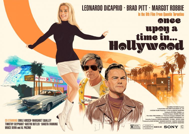
The UK based competition – which is to celebrate the home entertainment and digital release of Once Upon a Time over here in Britain, was run via PosterSpy, an online community for alternate poster artists. The brief was relatively simple, it had to be a 60s style poster, evoking the aesthetic of posters that would’ve come out when the film was set, in 1969. The three main stars had to feature (DiCaprio, Brad Pitt and Margot Robbie) – and most important, it just had to give off the essence of that classic, golden age of Hollywood. There aren’t many better people to judge this competition than Tarantino – and below are the three winners the filmmaker opted for, in order.
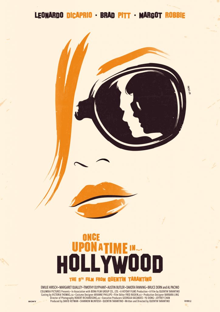
1st place – Rico Jr
“So honored that my poster was chosen as the first place of the contest by Mr. Tarantino himself. The theme of Hollywood and cinema’s making through his latest film obviously echo in me and I wanted to propose something. A piece that stands out from the traditional models while retaining this retro vibe and bringing my minimalist touch to it.”
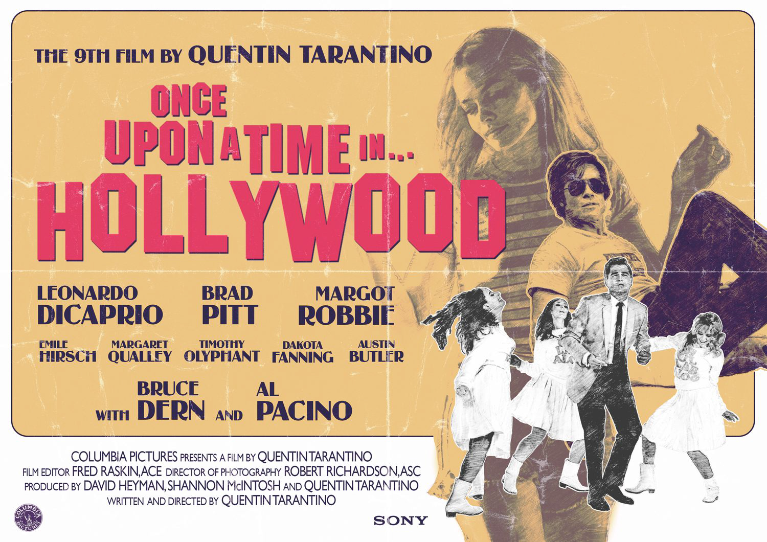 2nd place – Nuno Sarnadas
“I have been a Tarantino fan since “Pulp Fiction”, and this still is my favourite movie of all time. Tarantino’s definitely one of my favourite directors and having him pick my piece is something I would never expect in a million years. “Once Upon a Time…” is a wonderful piece of cinema, and it’s imagery is truly inspiring. For the piece I followed the brief’s hint and researched lots of posters from that time period. I just put together the elements I found worked together the best, and made a composition that would fit the late 1960’s in the most perfect way.”
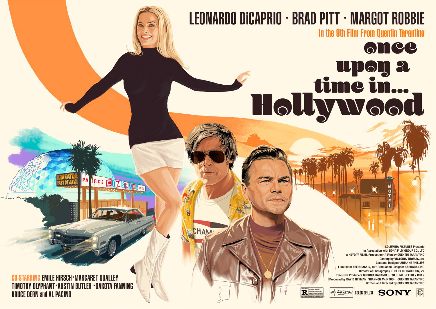
3rd place – Pete Lloyd
“Reservoir Dogs and Pulp Fiction came out when I was a teenager and were unlike anything I’d seen before. Along with True Romance (which I’ve seen so many times I could probably quote the dialogue back to you in its entirety!) these films made a huge impression on me and I’ve been a massive Tarantino fan ever since. So to have my poster chosen by the man himself is really special, a great honour. The brief provided solid art direction and I spent quite a lot of time studying iconic late sixties poster art by greats such as Robert McGinnis and Bob Peak for inspiration. With the floating vignettes, negative space, typography and spiral composition I did my best to evoke the feel of the period and setting in my own style.”












Leave a Comment